| |
2009 Logo Design Trends
11 trends that will define logo design in 2009
Everyone wants to set the curve when it comes to style. No one wants to design out of a book of trends, but nevertheless, they emerge.
Take a peek at the following 11 logo design trends that we think will define the look of 2009.

|
  |
This is an outgrowth of last year's trend, even though these boxes have been around a few years now.
We don't quite know who's doing the talking, but whoever it is, their bubble is popping up all over. This logo symbolizes communication, whether it be from the company or between its customers. LifeLogger, for instance, uses a speech bubble with a smile in it to illustrate how users can communicate through them to friends. They continue the use of three-dimensional speech bubbles in creating avatars for their users, as illustrated to the right.
In this way, the idea of communication represents the person themselves, showing the importance of contact.
|
 |
Everyone remembers a time when they laid on their back in the grass, staring at the clouds daydreaming or finding images in their puffs. Clouds are a powerful logo, conjuring imagery of dreams, creativity and playfulness. Sometimes clouds are combined with thought bubbles to invoke feelings of dreaminess. The clouds can be a 3D bubble or take on a flat feeling. Many of these cloud logos represent new ideas, hence the thought bubble. Many "clouds" came from new businesses on the internet, certainly a place for dreamers. Some, also include imagery of the sun, which evokes a feeling of a new dawn.
|
 |
Mirror, mirror, on the wall, what's the hottest trend of all? It might just be reflections. With Apple leading the way, looking like all their graphics were set on a shiny table, others are sure to follow. Dubbed by some as "the new drop shadow," reflections are taking over, especially on the web. The reflections might be skewed, such as in the logo for blinklist, indicating the location of some light source, invisible to the onlooker, but effective in creating even more of a sense of a whole different world the logo is in.
|
 |
In a graphic world where you can do nearly anything, some companies are keeping it simple with shaded rectangles. Their logo, in a contrasting white, pops out from the background. Shadow boxes have historically been a sign of amateurish design, but this new generation of effective logos has shown that good design will always be in style. With the popularity of rounded corners, these logos stand out with (oh no!) sharp edges and right angles. In some occasions, such as with the blurb logo, the rectangle can represent an image. Blurb used their blue shadow behind their name to symbolize a book, as they are in the book publishing business.
|
 |
With these new puffed-up logos, you don?t know whether to click on them or bounce on them. Now that the industry has overcome the production issues of gradients, designers seem to prefer air-popped graphics to the flat drawings of yore. Even desktop icons these days seem to have a rounded feel, like you might pop one with one good hard double-click. It?s a 2D world out there in Internet land, and these 3D images really make Web pages and logos jump out of the page, to where you feel you could run your hands over the computer screen and feel their bumps and curves.
|
 |
These cute little Tic Tacs of color are popping up all over the design world. Like many abstract symbols, the hot dogs can be used to mean many different things. Sometimes they denote movement or sound, such as in the logo for Snap. These lines, reminiscent of those drawn out of shocked cartoon people by children everywhere, can denote an idea, a feeling or a literal meaning. But no matter how they?re used in design, they are a powerful symbol of an upbeat emotion.
|
 |
With satellite tv and radio and wireless everything all the rage in the new millennium, a transmission beams are a quick way to show that they are on the cutting edge of technology. Many companies who use this logo trend deal in internet information. Part of what many of these companies are doing on the internet is taking user (or customer) information and sharing it with the world. The transmission beam, starting with a single dot (to represent the user), shows their ideas spreading out. It's the perfect symbol for publishing companies or blog sites.
|
 |
AOL's little man has some company, with others creating buddies to include in their logos. For companies that bring people together, these genderless little people are shown in pairs or groups. They provide a visual indicator of coming together. Others show just one of these symbols, usually as an avatar for their customer. Anyone looking for other people can be sure they?ve found them when they see a logo with a buddy.
|
 |
Transparency is still hot. Again, many may gasp as the mere though of using a shadow, but this updated version is nothing like the shadow boxes that have plagued generic design. These logos invoke images of blending together. Some, like the two transmission bubbles that seem to be popping out the little people in the BlueDot logo, can symbolize communication, or a sort of overlapping and blending of ideas. Others are a Venn diagram, showing where the company fits, such as Zopa.
|
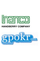 |
(I think this is another way to add sophistication, 3d effect to a logo)
Many are finding that nothing brings a logo to the next level like a professionally done outline. These surrounding lines or shades can simply run around the text or seem to encapsulate it in a bubble, as seen in the gpokr.com logo. These outlines can take text and make it seem as though it's one unit. Nicely done, these effects add sophistication and a third dimension to logos.
|
 |
From smiley faces to complex illustrations, every day punctuation has gained a new life in the tech typing world of the internet. While some used to only be used to denote the f-word, they're now used in the young on-line world on instant messaging, e-mailing and teen-speak in general. Now, these symbols have jumped out of instant messaging and onto billboards as of late, with their meanings left to the imagination of customers.
|
|
|